Thursday, February 20, 2014

Tell me what you REALLY think

I was looking through some old dummies I'd submitted when I was trying to get "The Woodcutter" published, and found something pretty hilarious:

You can vaguely make out some text on the first page. Someone must have scribbled a note on a piece of paper, which left an impression on the plastic cover of the front portfolio sleeve.  I'm not sure which publishing house/agency this particular portfolio went to, but here's what someone over there thought of my book, as it was making the rounds:

Pass - the art doesn't wow me enough + PB w/out child protag is hard sell -RS 

Kinda neat to get that little glimpse of a true, honest reaction from within the industry.

Friday, February 14, 2014

Beer label - BIG DUTCH

A few weeks ago, my cousin floated the idea of me designing a beer label. A colleague was turning 60, and to mark the occasion, he was going to brew a batch of beer, to be named "Big Dutch."  I'd never designed a beer label before, but the project intrigued me and it seemed like a good challenge (not to mention a nice element to have in my portfolio).  He gave me full latitude in designing the label, which was much appreciated.  I used an iPad app called ProCreate to whip-up a first draft:

Having gotten the composition worked-out, I got the paper and watercolors out, and ended-up moving away from the enormous naked guy:

A beer brewed with Steenstra's windmill cookies.  Mmmmmmm 
 I love the way the tulips and brickwork turned-out.  This was a really fun illustration project, and I would definitely not shy away from doing more beer labels in the future.  With the incredible popularity of craft brewing in Michigan, I'm sure the opportunities are out there.

Monday, January 13, 2014

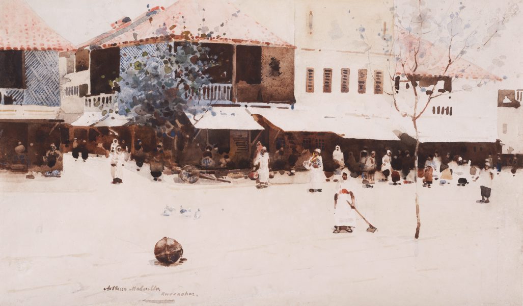
Negative space

Effective use of negative space has always been a challenge for me.  It's the idea of defining space and form by creating boundaries; it's allowing the viewer to infer shape and substance from the spaces you left blank.  To me, effective use of negative space is a sort of "addition by omission" in the same way that carving or etching is "addition by subtraction."
Here's an example from a master:
Arthur Melville (1858-1904), "Kurrachan"
Here are some examples from some guy with a blog (me):


Wednesday, January 8, 2014

A few more words on black walnut ink

I did some looking around, and it seems that many people who make their own ink have noticed two wonderful properties:

1.)  Excellent light-fastness (resistance to fading over time with exposure to light)
2.)  Increasingly waterproof over time.  This is great, because it allows for some tinkering before the ink completely sets permanently.

Most recipes also, it seems, include a dash of clove oil or whole cloves (to help improve the somewhat funky smell).  

Another:
30" x 22"
black walnut and gouache on 140 lb. Winsor & Newton Cold Press sheet

Monday, January 6, 2014

Homemade ink!

These are my first paintings of 2014, done with my first ever homemade ink (black walnut - see previous post).


All of these were done on 22" x 30" sheets of Winsor & Newton Paper (Hot Press, 140 lb.).  This is probably the finest paper I've ever used...I bought a bunch on-sale during Thanksgiving break from an art supply store back where my parents live.

Having such large quantities of ink available (and large sheets of paper) allowed me to experiment with some new techniques and tools.


I also tried using some gouache I had bought on-sale along time ago.  I love the vibrant, opaque color, and I'm excited to experiment further.

Apparently, the color is "Carmine"
Happy New Year!!!1


Juglans nigra

pretty gross looking in here.
This is a cast iron cauldron of black walnut husks, happily simmering away on the stove (I waited for Elin to leave for lab before I began).  This process started last fall, with the collecting and de-husking of several pounds of black walnuts.  I packed the fresh husks into a bucket and let time and nature work their magic.  After all the husks had oxidized and turned black, I transferred them to the cauldron, covered them with water, and left them to marinate in their own putrescence for a couple months.  Things got pretty moldy (but surprisingly not-stinky), and this is what I ended-up with:
Can you believe this stuff is free??
So, one day, I decided it was time to take the next step: on to the heat.  After a few hours of boiling and reducing, I strained off all the liquid and was left with:
Ta-DAAAA!
A few jars of homemade black walnut ink!  I added salt to some jars and methanol to others, to prevent mold.  I packed the husks back into an empty paint can and stored it for a possible Round 2 of ink-making if I run out before the next crop of walnuts starts to fall next autumn.

Thursday, November 7, 2013

A Unicorn for Elin

~13x15 in.  Coffee and ink on watercolor paper
My second, and dare I say more successful, attempt at painting with coffee.  I painted this for Elin muuuuch earlier this year, and I just got around to getting it matted and framed.  I found the frame (oak, with a nice finish) a long time ago...either on a curb, or in a dumpster.   Apparently they were all the rage in the latter half of the 20th century, according to the folks at the local frame shop.